
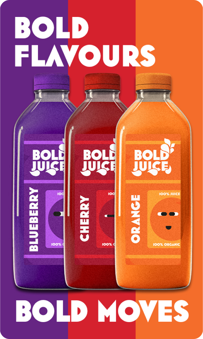
Boldjuice was designed for energetic individuals who value healthy and natural products. Visual identity relies on simple yet bold colors corresponding to three juice flavors. With minimal information on the packaging, the focus is on instantly catching attention and standing out on store shelves.
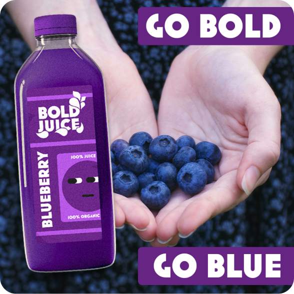
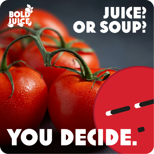
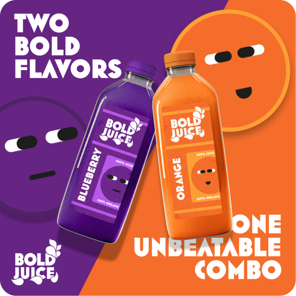
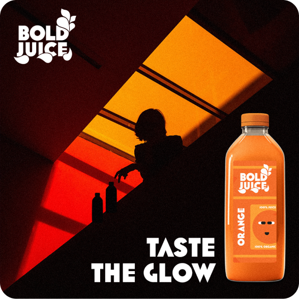
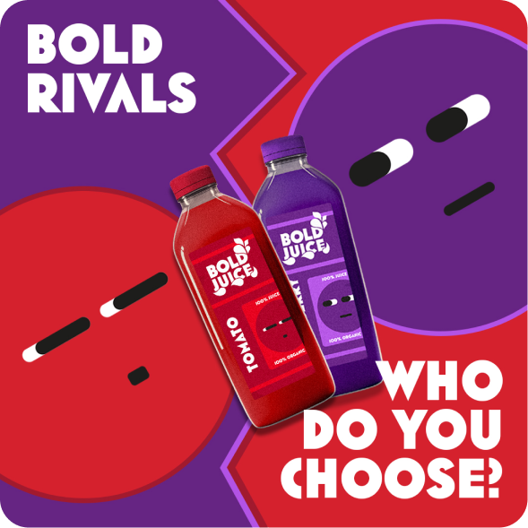
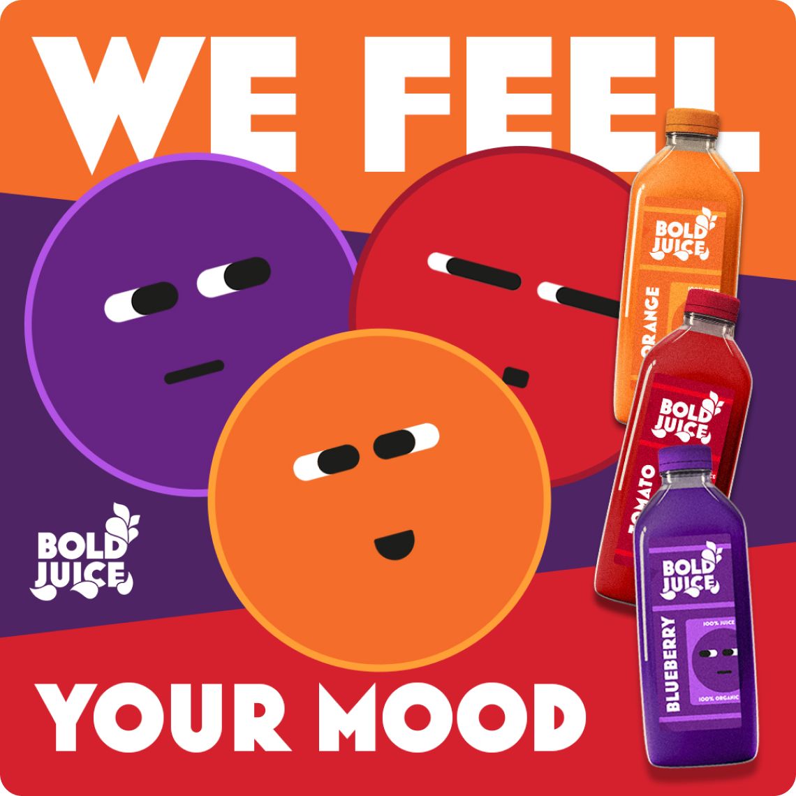
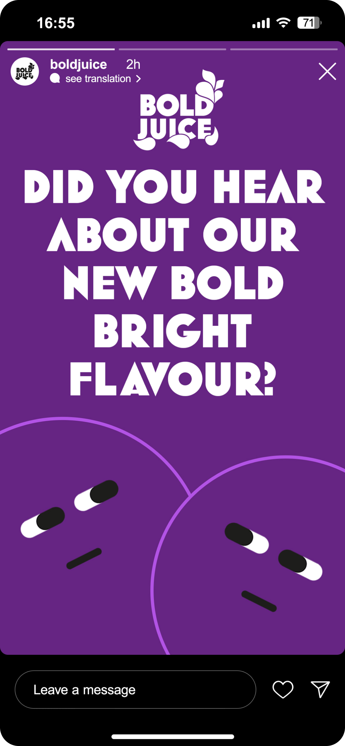
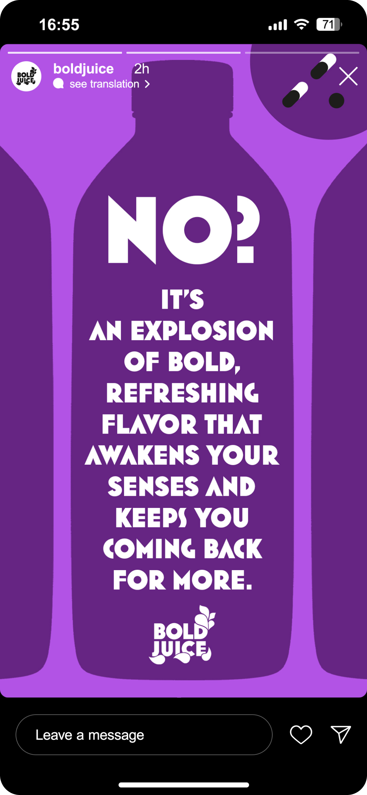
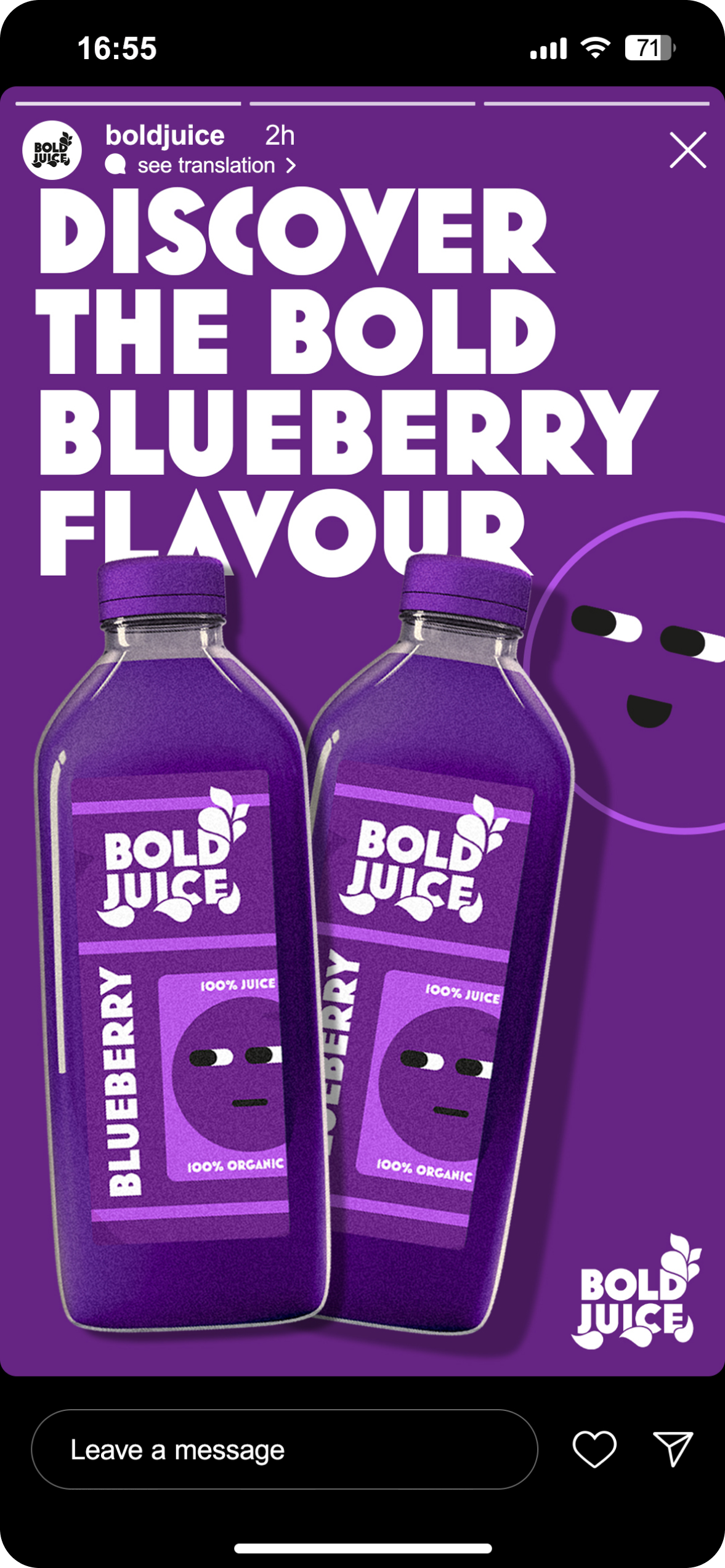
Characteristic elements are illustrations of funny characters with expressive faces, which give the design a light, friendly tone and build positive emotions. The logo, although minimalist, perfectly matches with vibrant packaging. The colours of each flavor, according to the type of fruit, have been chosen to evoke specific associations and feelings of energy, freshness and naturalness flowing from the fruits.